SUBSCRIBE


The New Rules of the Gallery Wall: Making Personal Photos Feel Stylish
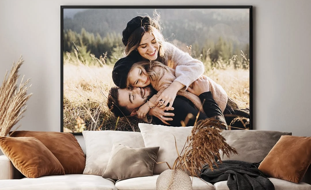
A gallery wall once meant a cheerful cluster of mismatched frames, family snapshots and holiday memories. Today, many of us prefer our gallery walls to have a more curated, considered look. The new approach is less about filling every gap and more about creating rhythm, balance and a sense of intention – not with the aim of making your home look like a showroom, but in order to give your memories more impact. Here’s how:
Start With a Clear Mood
Before choosing images, decide what you want the wall to feel like. Calm and minimal? Warm and nostalgic? Bright and playful? This mood should guide everything from colour choices to frame finishes. For example, canvas prints can feel fun and informal, while carefully framed high-quality photographs will look special and sophisticated.
For a refined look, choose photographs that share a similar palette. Black and white family portraits, sunlit coastal shots or soft neutral interiors can all work well when grouped together. If your images are very different, consider editing them in the same tone or filter so they feel connected.
This does not mean removing personality. The goal is to create harmony, not uniformity. A candid photo of your child laughing, a wedding detail, a favourite landscape and a treasured pet portrait can live together if the colours and presentation are carefully handled.
Mix Sizes, But Keep Structure
One of the biggest shifts in gallery wall styling is the move away from perfect symmetry. Modern displays often look best when they feel slightly relaxed. However, relaxed does not mean random.
Choose one larger piece as the anchor, then build around it with smaller images. This gives the eye somewhere to land. If every picture is the same size, the wall can feel flat; if every piece competes for attention, it can feel chaotic.
A good rule is to vary scale but repeat spacing. Keep a consistent gap between pieces, usually around five to eight centimetres. This small detail instantly makes the display look more polished.
Think Beyond Matching Frames
Matching frames are safe, but they are not the only stylish option. A mix of finishes can add depth, especially when chosen thoughtfully. Black frames feel crisp and modern, natural wood adds warmth, and brass or antique gold can bring a softer, more decorative note.
The trick is to limit your materials. Two finishes are usually enough; three can work if the colour palette is restrained. For example, black, oak and slim metallic frames can sit well together if the photographs are mostly monochrome or muted.
Mounts also matter. A generous white mount can make even a casual phone photograph feel elevated. It gives the image breathing room and creates a gallery-like effect without feeling overly formal.

Include Space Around the Memories
A common mistake is placing personal photos too close together or filling a wall from edge to edge. Negative space is what gives importance to each image.
Leave enough room around the outside of the arrangement, particularly if it sits above a sofa, console table or bed. The display should feel connected to the furniture beneath it, not as though it is floating awkwardly. As a general guide, hang the centre of the arrangement at eye level and keep the bottom edge around 15 to 25 centimetres above furniture.
If you are unsure, lay everything out on the floor first. Better still, cut paper templates to the same size as each piece and tape them to the wall. This lets you adjust the composition before committing to hooks and nails.
Add Unexpected Details
The most memorable gallery walls include more than straightforward portraits. Try adding a handwritten note, a map from a meaningful trip, a small textile, a child’s drawing or an old family recipe. These details create layers of story and stop the wall from feeling too predictable.
Personal does not have to mean sentimental in an obvious way. Sometimes the most stylish pieces are quiet references: a blurred beach scene from a favourite summer, an architectural detail from your first home, or a close-up of flowers from a family garden.
Edit as Life Changes
A gallery wall should not be frozen in time. The new rule is to treat it as an evolving display. Swap images as seasons, milestones, and tastes change. Keeping the layout flexible means your wall remains fresh while still holding onto the memories that matter.
Ultimately, a stylish gallery wall is not about perfection. It is about choosing personal photographs with care, giving them space, and presenting them in a way that feels true to your home. When memory and design work together, the result is both elegant and deeply yours.
More to Love!
Transform Your Walls with Prints
Living Room Magic: Personalized Poster Prints for Cozy Ambiance