SUBSCRIBE


Sideboard Styling: Creating a Personal Focal Point in the Dining Room
Picture two dining rooms. In the first, the sideboard holds a matched pair of ginger jars, a stack of coffee-table books, and a tray of faux lemons. Everything is balanced, and nothing says much. In the second, the arrangement is looser: a hand-thrown bowl brought back from a trip, a small painting found at a local fair, an inherited brass candlestick, and a lamp casting a warm pool of light across all three. The second room isn’t more expensive or more carefully planned. It simply belongs to someone, and that is what good sideboard styling is really about.
A sideboard sits in the line of sight from the table and is often the first surface you notice on entering the room. That makes it an unusually good place to show what you care about, as long as the arrangement is built around meaning rather than filled to look finished.
Start With One or Two Objects That Matter
Instead of beginning with a mood board or a shopping list, start with what you already own. Look for one or two pieces with a story or a strong presence: a ceramic vessel you love, a serving dish passed down in the family, a painting that has moved with you from home to home. These become the anchors, and everything else is chosen in relation to them.
Anchoring the arrangement gives the composition a clear focal point, so the eye has somewhere to land. It also makes later decisions easier, because each new object either supports the anchor, by echoing its color or contrasting its shape, or competes with it and doesn’t belong.
If nothing feels significant yet, one piece you genuinely like is enough to begin; the display can grow from there.
Art or Mirror: Choosing the Backdrop
The wall above the sideboard frames everything on it, and the two most common choices behave quite differently.
Art adds content. A painting, print, or textile brings its own color, subject, and mood, and it can set the palette for the objects below. Hung, a piece feels settled and more formal; leaned against the wall and overlapping a lamp or vase, it feels more relaxed, though it takes up surface space and needs to sit securely.
A mirror adds light and depth, but what it shows depends entirely on what faces it. Opposite a window or a pleasant view, it can carry daylight and greenery deeper into the room. Opposite a busy kitchen counter, a blank wall, or a light fixture, it simply repeats those instead. Before committing, stand where the mirror would hang and check what it reflects from the dining chairs, not just from the doorway. A mirror can make a room feel more open, but that isn’t guaranteed.

Build Layers With Height, Shape, and Texture
Once the anchor and backdrop are set, layering is mostly about contrast. Vary the height of objects so the eye travels across and up the arrangement: a tall lamp or branch-filled vase at one end, something mid-height such as a candlestick or a short stack of books, something low like a shallow bowl. Vary silhouettes too. A round vessel beside a slim vertical one reads more clearly than two similar shapes side by side.
Texture adds depth even within a narrow palette. Glazed ceramic, rough linen, aged brass, raw wood, and glass all catch light differently, so a group of objects in related colors but different materials often feels richer than a scattered mix of bright ones.
Grouping objects in threes is a familiar tip and a reasonable starting point, but it isn’t a rule. What matters more is that each grouping looks intentional, with clear relationships between the pieces.
Leave empty space as well. A clear stretch of the sideboard gives each object room to be seen on its own and keeps the composition calm.
Lamps and the Quality of Light
Few decorative choices change a dining room’s mood as much as a lamp on the sideboard. Overhead light alone can make a room feel flat; a lamp at sideboard height adds a lower, warmer layer that suits evening meals and draws out nearby textures.
Scale matters. A lamp that is too small looks like an afterthought beside a long cabinet, while one that is too large can crowd the art above it. Look at how the shade meets the artwork. When the shade overlaps the lower edge of a frame slightly, the two read as one composition; when it covers the painting’s main subject, they compete. Fabric and paper shades diffuse light softly, while opaque or metal shades push it down onto the surface below.
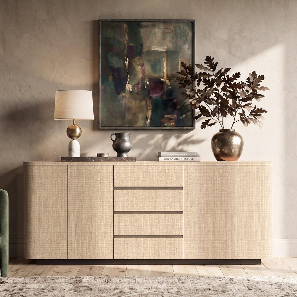
Cords deserve attention, too. A cord run down the back of the sideboard and kept close to the lamp base all but disappears, while one draped across the front pulls focus. If you want a different power arrangement, such as a new outlet, consult a qualified electrician rather than improvising.
Connect the Sideboard to the Rest of the Room
A sideboard looks most at home when it shares something with its surroundings. A little repetition goes a long way: the wood tone of the table echoed in a bowl, the color of the chairs picked up in a vase or in the painting above, the metal of a pendant repeated in a candlestick. One or two of these links is usually enough. Repeating everything makes a room feel matched rather than collected.
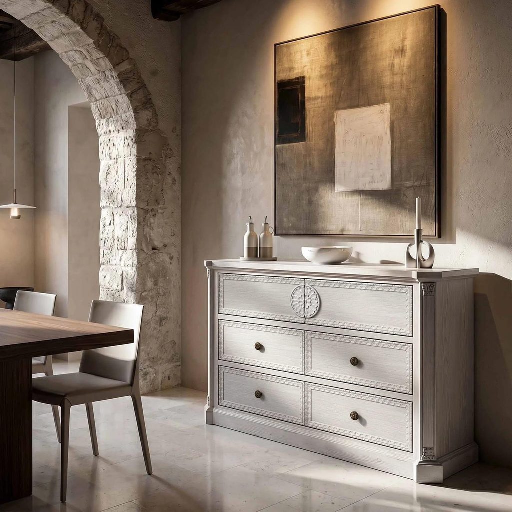
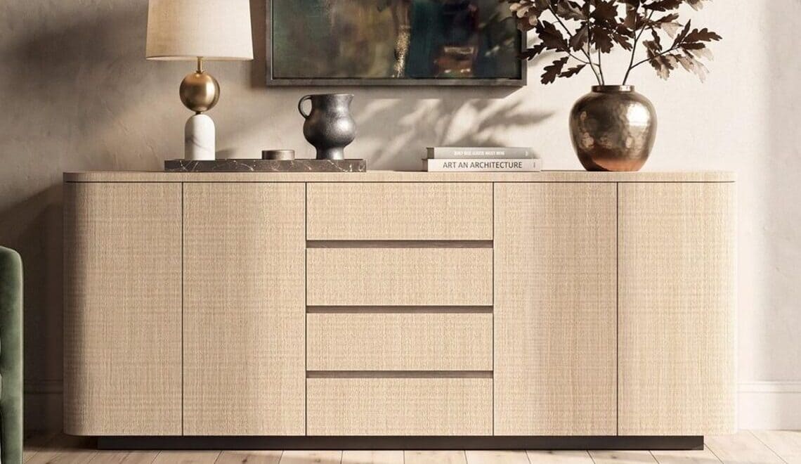
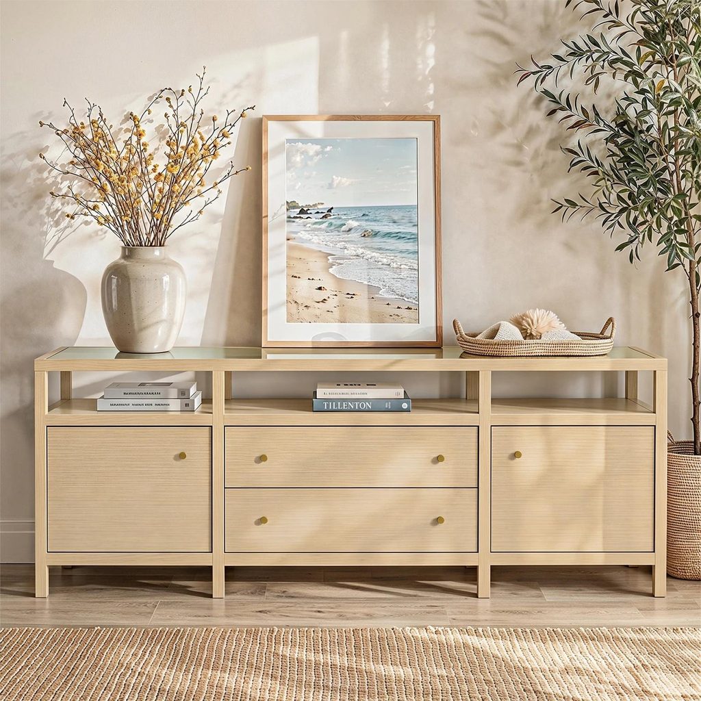
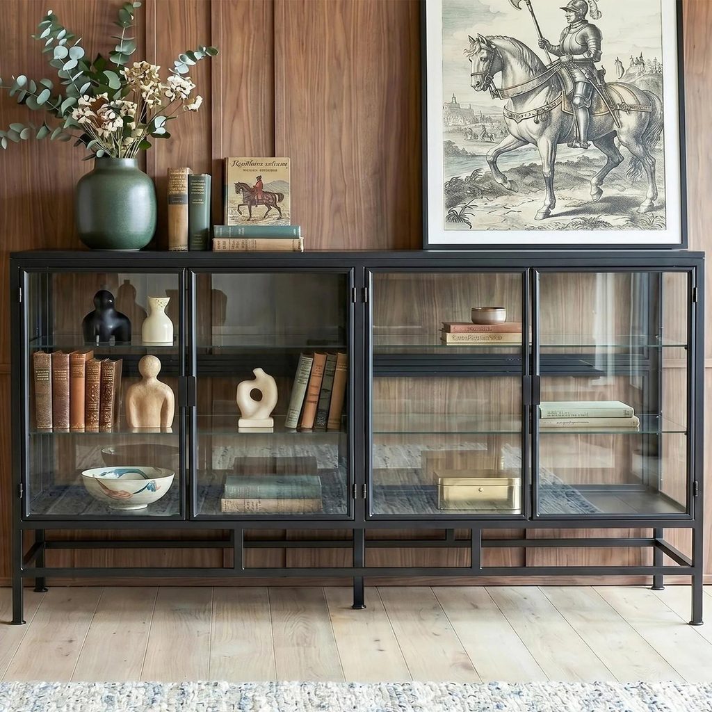
Contrast keeps the composition alive. If the table and chairs are pale wood, a darker sideboard can ground the room. The cabinet itself also sets the tone. Clean, flat doors make a quieter backdrop for busy objects, while carved detail, curved edges, or glass fronts bring a character of their own and may call for fewer things on top. Browsing HOMSEE sideboards and buffets shows several of these forms side by side, from flat-fronted cabinets with rounded edges to carved and glass-fronted pieces, which can help clarify which style suits the objects you plan to display. Finishes and details differ from item to item, so read each piece’s own description.
A Hypothetical Arrangement, Step by Step
Imagine a dining room with a pale oak table, black chairs, and warm white walls, with a low sideboard in a medium wood tone along the longest wall. The anchor is a large stoneware bowl in muted green, a gift from a friend who makes pottery.
Above the sideboard, a framed landscape in soft greens and ochres wins out over a mirror, because the opposite wall holds a kitchen pass-through that a mirror would mostly reflect. The painting hangs so its lower edge sits just above the top of the lamp shade, keeping the two connected.
A ceramic lamp with a linen shade stands at the left end, its cord routed down the back. The green bowl sits slightly right of center, beneath the painting. Farther right, a slim black candlestick repeats the color of the chairs, and two stacked books topped with a small brass dish add a low layer. The right-hand third of the surface stays mostly clear.
Each choice involves a trade-off. The asymmetry feels relaxed, but it relies on the lamp’s height to balance the lower objects on the right. Choosing art over a mirror gives up some reflected daylight, which the lamp makes up for in the evening. Keeping the objects few means each one can be seen clearly.
Let It Change With You
Sideboard styling is never really finished. Objects come and go with seasons, travels, and gifts; a painting is swapped for another. The goal isn’t a fixed composition but a surface where the things you care about are given space and good light. When every object there has a reason to be there, the arrangement will feel unmistakably yours.
More to Love!
The Role of Dining Room Lighting in Creating a Comfortable and Functional Home
Mixing and Matching: How to Choose the Right Dining Room Chairs